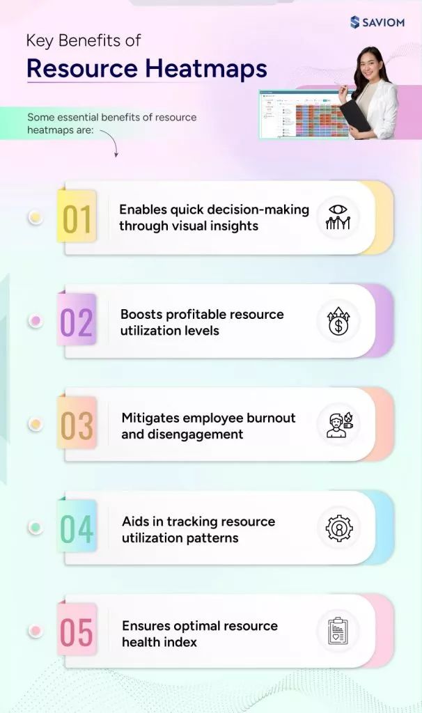
A resource heatmap graphically represents workforce utilization against capacity or availability across multiple dimensions such as roles, skills, teams, locations, etc. It uses color-coded indicators, helping managers quickly spot over or underutilization, enabling them to take necessary steps to balance workload and improve productivity.
Generally, resource heatmaps can be categorized into overall, strategic, billable, and non-billable, each offering unique insights into how resources are utilized. Some key components include color codes, dimensions, timelines, units, etc., which are highly customizable.


